Navigating the World of UI/UX Design Laws
UI/UX design is about more than just aesthetics and user interaction; it is also about adhering to a plethora of rules and regulations in order to deliver a safe, ethical, and accessible user experience.


Navigating the World of UI/UX
Let’s look at several UI/UX design guidelines and concepts, as well as prominent instances that highlight their importance in creating user-centric digital experiences.
User Interface Law: Fitts’s Law
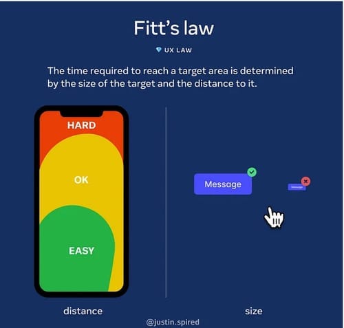
Fitts’ Law states that the time required to go to a target area is proportionate to the destination’s distance and size. The Windows Start button is a good example of this rule in action. It’s hidden in a corner for quick access, and its small size makes it an easy target for people to click on.
How may Fitt’s law be used in UI design?
- It is compatible with all elements of the app and website. Reduce the size of your menu or drop-down menu.
- If you’re creating a button to finish an activity, make it larger so it’s easier to pick.
- Make your list longer for only one action so the consumer can choose more easily.
Hick’s Law: The Paradox of Choice
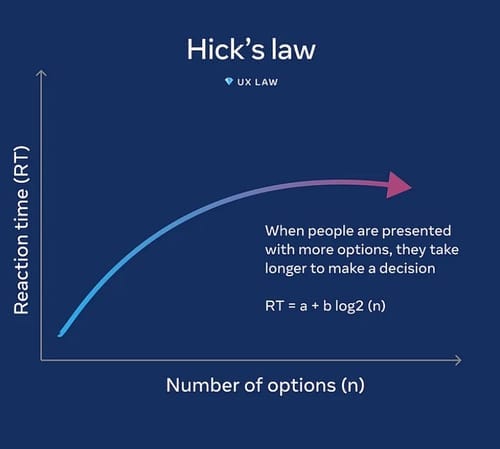
Hick’s Law suggests that the more choices users have, the longer it takes them to make a decision.

Too many alternatives lead to poor decision-making, which leads to bad ideas and subpar goods. Information overload makes it difficult for the user to take action. As a result, your options are limited.
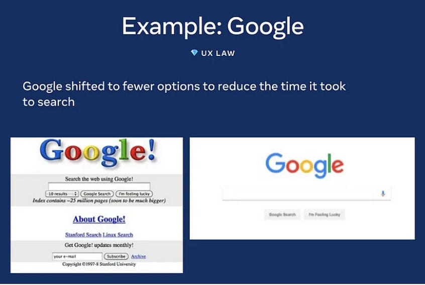
A good example is Google’s basic search page. Users may quickly type their query and discover what they need with a single search box and few distractions.
How to use Hick’s law in UI?
- A card sorting method is an effective way to get a sense of what users find most important.
- Use images properly. Taking away images will make the design unusable
Consistency Law: Jakob’s Law
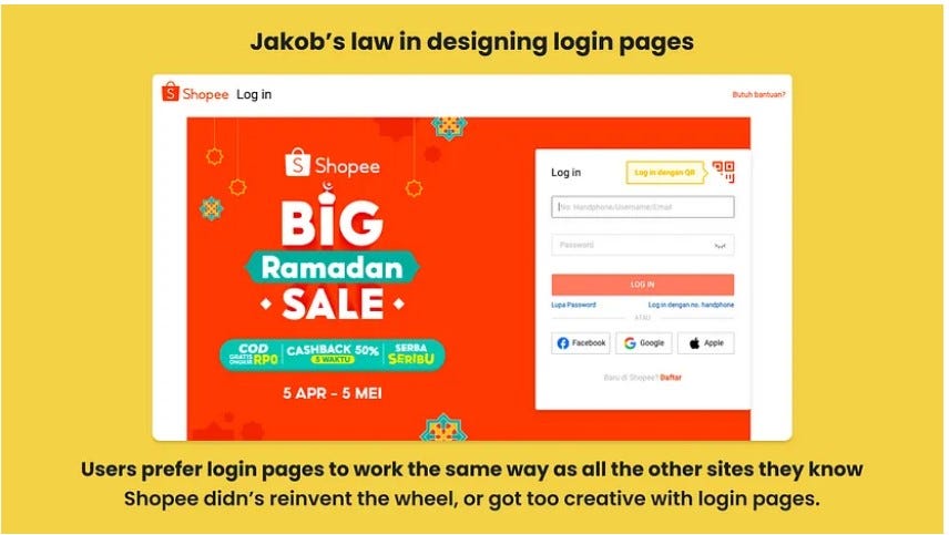
Jakob’s Law emphasizes the necessity of design consistency.
A website’s user expects it to perform similarly to other related websites. Jakob’s law advises employing recognisable patterns in design to create a better user experience. It implies that your effort to create something distinctive and amazing may occasionally hinder the user experience simply because the user is unfamiliar with it.
How to use Jakob’s law in UI?
- Follow the visual hierarchy of reading patterns strictly.
- Create product experiences that suit the layouts and styles of your brand.
- Designers may simplify the design process by employing comparable design patterns.
Performance Law: Miller’s Law
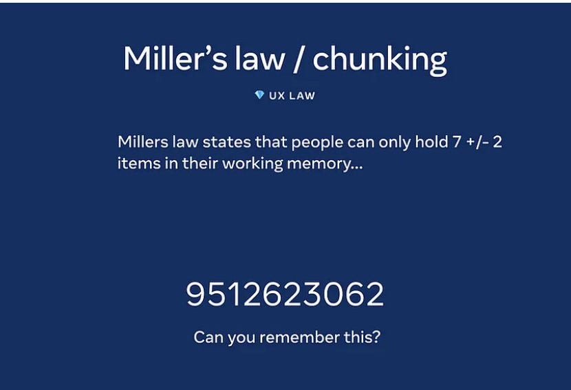
Miller’s Law posits that the average person can only hold about seven items in their working memory.
Miller claims that our average short-term memory and absolute judgement are restricted to 7 seconds. As a result, the number 7 has earned the moniker “magic number.” Because the range varies from 5 to 9, this is not a set value for chunking. Seven (plus or minus 2) is a manner of structuring things to make them more understandable to humans.
How to use Miller’s Law in UI?
- Always offer stuff in a manageable manner by grouping it.
- Chunking is a good way to show them in groupings.
- The average content section has five to nine alternatives. You can get rid of alternatives that a user thinks are unnecessary to lower the number of possibilities.
Aesthetic-Usability Effect
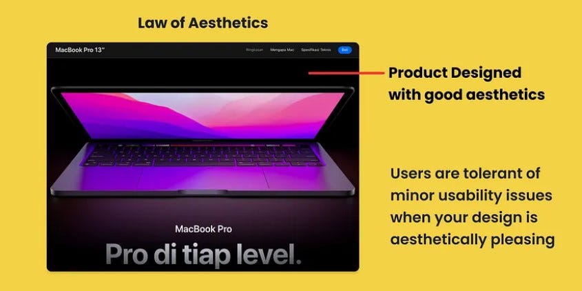
According to the aesthetic-usability effect, consumers regard more visually beautiful designs as more useable.
Even if there is no intrinsic functional advantage, users view visually beautiful designs as more useful and effective.
How to use the Aesthetic Usability Effect in UI?
- Make your interface visually attractive. Design with the interaction model of humans in mind.
- Focus on the high-friction elements of your marketing funnel (top landing pages, bottom of the funnel phases such as checkout flow) to uncover high-value areas of your funnel and direct your most engaged customers to them.
- Incorporate ongoing consumer feedback into the product design process.
Law of Proximity

Objects that are next to, adjacent to, or otherwise near one another are grouped.
The foundations of visual design include grouping related objects together and exploiting space to make meaningful groups. Because the user is sufficiently focused on the objective and has quick access to the page, keeping this definition visible improves usability by supporting users in quickly discovering and focusing on only the UI components most relevant to their current activity.
How to use the law of proximity in UI?
- Include things that belong together to make your writing more readable.
- Use white space to visually separate photos, headlines, descriptions, and other content on your page.
Law of Similarity
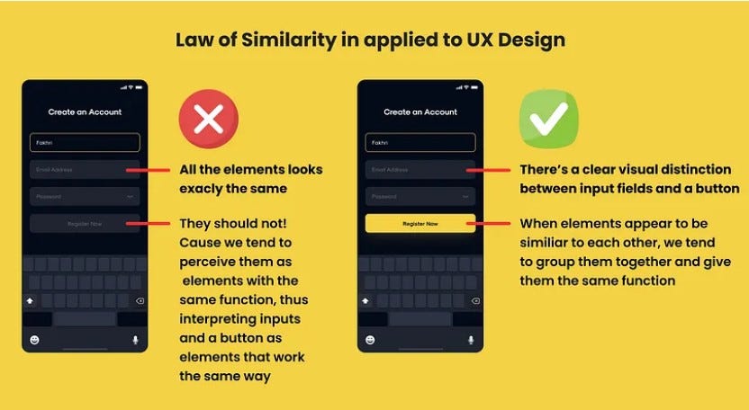
When elements are similar in shape, size, colour, or other features, we view them as a group. Despite their isolation, related design elements tend to appear connected.
We prefer to group two objects that appear to be related and assign them the same function.
Despite the fact that those sections appear to be identical and evenly spaced, we prefer to arrange them by colour.
How to use the law of similarity in UI?
- When building an app, employ comparable styles for each design element, such as buttons and action sheets. This allows users to immediately recognise items and makes using the app much easier.
- Break the design or text pattern to create interest. Elements with several functionalities might be a wonderful approach to catch readers’ attention when they first arrive at a website. Pair these items with clear language that emphasises their usage and purpose.
Conclusion
Navigating the realm of UI/UX design laws is essential for creating digital experiences that are not just aesthetically appealing but also helpful, accessible, and compliant with legal and ethical norms. By examining these rules and learning how popular examples apply them, designers can create user-centric designs that endure the test of time and legal scrutiny.
Get AI scheduling insights, product news, and Bay Area community updates delivered to your inbox.
No spam. Unsubscribe anytime.